
Professional Image was important to Susan L. Baumgartel, one of our clients who was Head of Global Sales & Marketing at Assurant Solutions. Sue knew how important a Professional Image was for her employees as well as the brand of the organization.
“Excuse me. I have this conference room reserved for 9:00 AM.” The man sitting in the room looked at me quizzically, laughed, and said, “Sue, I think I’m part of your meeting. Didn’t you invite me to be here? I was stunned. The man I had known for more than a decade had been transformed beyond my recognition!” Susan L. Baumgartel
This was from the part of her Foreword in our book called, “Don’t Go to Work Naked!” Sue went on to say, “During my 10 plus years as a creator and director of a corporate in-house sales school, I have seen many such transformations, some more dramatic than others, but always with tremendous results.
One might say that anyone can receive an image face-lift with a new set of clothes – the right colors, proper fit – but when the transformation comes from the inside and is manifested in renewed confidence, and a true brand image that represents your corporate environment, you have a winning program!
DO I HAVE TO CHANGE TO CREATE A PROFESSIONAL IMAGE?
Applying the principles from beyondCHUVA’s® image programs are designed with the goal of growing people – NOT fixing them – but helping them create and refine their own brand image that will enrich you and your organization and lead to a return on investment that goes beyond dollars: trust is built, influence is stronger, deals are closed, people are promoted, confidence grows, and loyalty increases.”
When it comes down to it, your professional image impacts all these that Sue mentioned. And I must say, I couldn’t have said it better. Your image represents your brand. It’s how you package yourself. You have your unique coloring, body type, and personality, and all these combined create a professional image that is only reflective of you!
Sue is now happily retired! Thank you, Sue, for 10 great years of respect and value. We appreciate you!
Before I dive into the blog, let me first explain the difference between a professional image and a professional presence. These are oftentimes misunderstood, and it is not just semantics. There is a difference and it’s important for you to understand both as they are interrelated
IS MY PROFESSIONAL IMAGE AFFECTING HOW I SHOW UP IN BUSINESS?
At beyondCHUVA’s®, we have analyzed and worked with thousands of professionals on developing his or her professional image. What we have noticed through these years is that there are extreme image consultants/stylists that swing from one spectrum to the other.
On one side, some go strictly by science. If you “have” this, then you are “this”. For example, if you belong to “this” color palette, then you can only wear “these” colors from that palette. God forbid you to wear black when it’s not in your palette.
Is your image increasing your success potential, or is it a distinct liability in helping you reach your career aspirations?
Perception VS Reality!
1. You never get a second chance to make a first impression.
While this phrase is overused, it implies that people never give you another opportunity. In reality, most people do give second chances. Still, it’s true that your professional image sets the tone when you meet someone new. The way you present yourself should reflect confidence and competence right from the start.
2. Don’t judge a book by its cover.
Despite this advice, first impressions matter in business. People might not judge, but they do form quick assumptions. If your appearance is disheveled or unkempt, others may assume you lack attention to detail.
3. A wolf in sheep’s clothing.
Authenticity is essential. Trying to be something you’re not, or pretending until you “make it,” rarely serves you well in the long run. Instead, your appearance should align with who you really are and support your self-confidence.
WHAT RULES CAN I BREAK WHEN IT COMES TO A PROFESSIONAL IMAGE?
Then you have the other extreme. It doesn’t matter what the “rules” are, break them all. It’s all about art and nonconformity. I often refer to this group as a stylist. Not all, but most, go with what’s in fashion. So, my response is, if it’s in fashion and it doesn’t look good on should you still wear it? To that, I say, no!
I am not insinuating that you should not incorporate fashion into your wardrobe, you should. It’s just how you do it. Let yourself dictate the look, not fashion; however, if you are wearing outdated things and out of fashion, then your personal brand will be perceived as outdated as well, so select wisely.
At beyondCHUVA’s®, we have analyzed and worked with thousands of professionals on developing his or her professional image. What we have noticed through these years is that there are extreme image consultants/stylists that swing from one spectrum to the other.
On one side, some go strictly by science. If you “have” this, then you are “this”. For example, if you belong to “this” color palette, then you can only wear “these” colors from that palette. God forbid you to wear black when it’s not in your palette.
HOW DO I CREATE BALANCE WHEN IT COMES TO MY PROFESSIONAL IMAGE?
The key to building your professional image is to create a balance between the two. The science approach provides you the direction in where to begin building your image. The art aspect teaches you ways to “bend the rules” so to speak to create an image that is perfect just for you and only you.
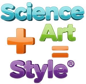
To make this an easy process, we created the formula: “Science + Art = Style™”. It is important to know that these elements that make up this equation can be broken down into both a science and an art. Let’s look at each aspect of this formula and how you can apply it to yourself. You will begin to see that by combining each aspect from both perspectives (science and art), you will be able to make conscious, intelligent choices when it comes to building your wardrobe and being dressed appropriately at all times.
PLEASE NOTE: We are not suggesting wearing anything you want, whenever you want; this is not realistic; however, what we are suggesting is to take an inclusive approach to build your professional image that is representative of your personal brand.
WHAT TO WEAR TO WORK!
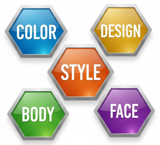
To answer this question, you need to know that your Professional Image is built around the following 5-Primary Image Disciplines. This blog talks about the foundation of any professional image, and that’s color.
The first aspect refers to your Personal Coloring. Color is the foundation for building any wardrobe and should not be taken lightly. Depending upon your personal coloring, specific colors can help you look fresh, component, and powerful, while other colors can make you look tired and washed out.
WHAT DOES COLOR HAVE TO DO WITH MY PROFESSIONAL IMAGE?
To make this easy for you, beyondCHUVA® created the first of its king, the Elemental Digital Color Analysis System to determine if you are a Fire, Earth, Air, or Water. These four palettes help determine which “colors” best harmonize with your skin, hair, and eye colors, therefore, making it easier to determine which colors are best for your clothing, hair, makeup, and accessories. If you follow the “Color Concept” for each palette, then you will enhance your professional image tremendously!
These palettes were created as a new generation of color analysis, which was made most popular by Carole Jackson, who created the Color Me Beautiful system, where she categorized your coloring as a Spring, Summer, Winter, or Autumn. Working with Carole and her team earlier in my career, and as their national trainer, I learned a great deal. I am where I am today because of Carole’s creations. Thank you, Carole!
As I moved into corporate America with this newfound journey, I began to see how adjustments needed to be made to make the information more marketable for men as well. Male CEOs didn’t like being called a “Spring”, so we have the new color system for men now.
We also added new colors and changed names to accommodate the current market. In addition, we created the Numerical Charting System™ so that professionals could learn how to make the most of their budget wardrobe dollars. In short, our system reduces your shopping time by 50% and your mistakes by 100%.
These palettes are designed by a scientific approach; however, how you apply them is as much about science as it is art!
Suffice to say, it’s great to know that you fit into one of these categories. It provides you direction on where to begin making conscious color choices for your wardrobe, accessories, makeup, and hair; however, there is the aspect of personal taste. Below describes the “Color Concept” to give you a visual of each palette.